Concept Food Delivery App for fictional Japanese food restaurant chain. Developed during the Google UX course on Coursera.
As this is my first foray into developing an app and properly delving into the world of UX/UI, the overall app concept is simple. My main goals here were:
. better understand the UX research process when developing a digital product.
. work on my UI and graphic design skills focused on a mobile application.
. better understand the UX research process when developing a digital product.
. work on my UI and graphic design skills focused on a mobile application.
. gain experience working with wireframes and prototypes in Figma and other software such as Adobe XD required for digital design.

Introduction.
The prompt I had from the UX course was to develop a food delivery app for a restaurant. With that in mind and taking into account my love and fascination with Japan, I decided on creating an app for a fictitious Japanese restaurant named Japan House.
Japan House, would be a London based medium sized sushi restaurant chain which offers good quality sushi at a budget price. They have grown to a total of 9 locations accross London with plans to keep growing and expand to other cities within the UK and possibly overseas in Europe and the US.
However, they have been facing some problems with their current delivery app which has led to a decrease in home delivery purchases.

Problem
Japan House has seen the revenue of its home delivery orders drop in more than half of its restaurant locations. Home delivery currently can only be made through a phone call or a non-user frendly app.

Goal
Increase number of online orders by designing an app for Japan House that improves user experience by making the food ordering process quicker, easier and more convenient.

My Role
UX designer responsible for the end-to-end design including user research, UI, wireframes, lo-fi, usability test, mockups, hi-fi prototype and others.

Responsibilities
Conducting interviews, paper and digital wireframing, low and high-fidelity prototypes, conducting usability studies, accounting for accessibility, and iterating on designs.
Discoveries.
One of the first steps I took was to speak to friends and family about their experience ordering food on different apps. One initial insight I had from these talks is that the vast majority of their experiences had been with major food delivery apps such as Deliveroo, Uber Eats and iFood. Experience with apps from specific restaurants were rare and limited to McDonalds or Dominoes.
I then conducted some desk research and looked at what other brands, be it direct or indirect competitors, currently offer in terms of delivery services.
Focusing on Japanese food restaurants in London, what I found was that very few had an app. The most direct competitor, Itsu, has a decent app but they only offer in-store pick up and no home delivery.
I also took a look at some of the prominent food delivery apps such as Uber Eats, Deliveroo and iFood to gain some insights on usability, information architecture, UI and general layout.
Benchmarking & Competitive Audit.
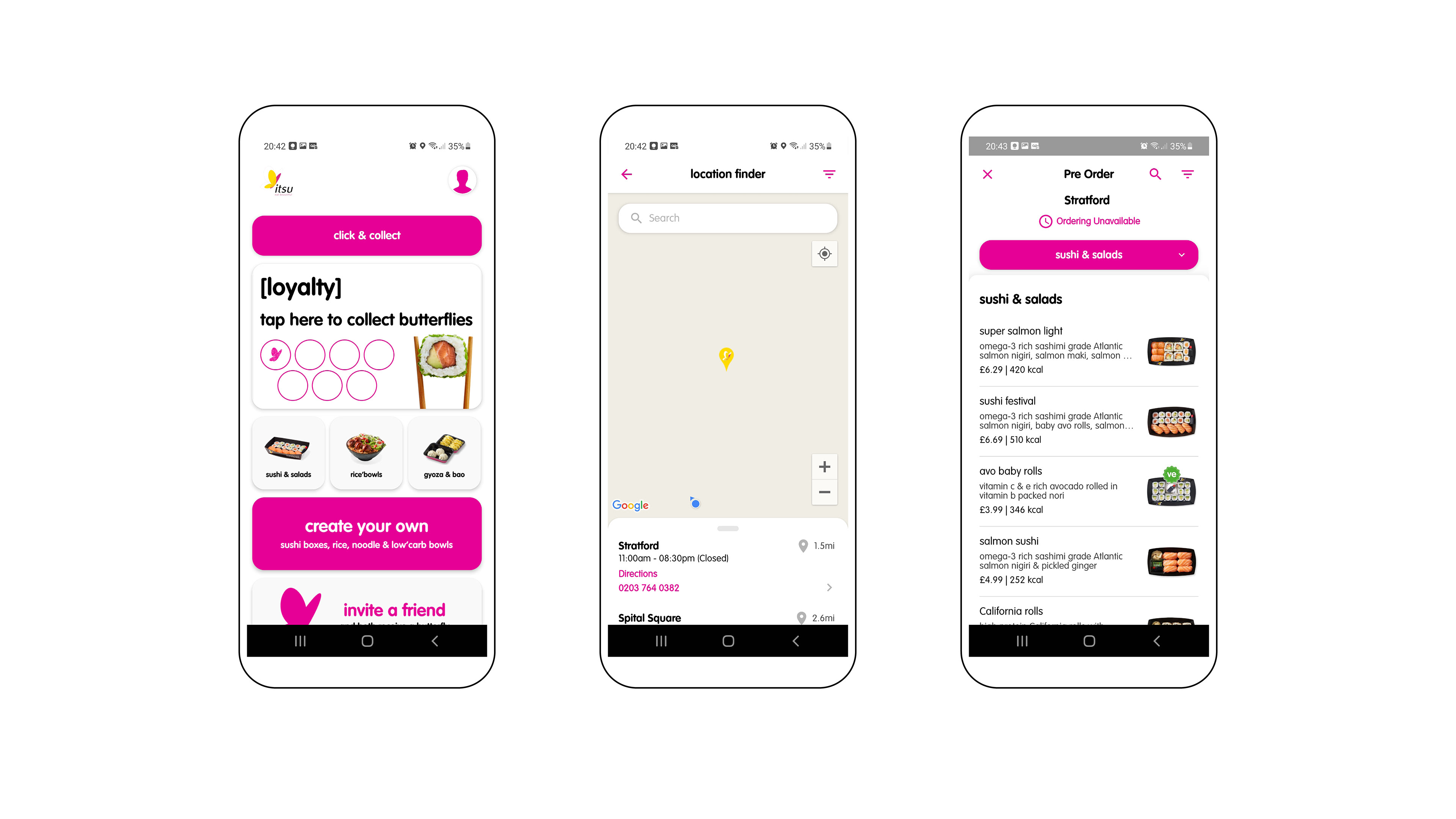
Itsu
Simple app with a clean layout in line with the brand language. Navigation is easy and it has what you would expect from a medium sized restaurant chain. Highlights to the "Create your own" option and loyalty points. However, the map in the location finder was glitchy and the background was blank. No home delivery option.
Simple app with a clean layout in line with the brand language. Navigation is easy and it has what you would expect from a medium sized restaurant chain. Highlights to the "Create your own" option and loyalty points. However, the map in the location finder was glitchy and the background was blank. No home delivery option.
Deliveroo
Although this is a food delivery app, there were some interesting references to take into consideration when developing the Japan House app. It's relatively easy to navigate, categories are well distributed and layout is consistent. The app can become a bit cluttered with a lot of offers and the basket page is a bit confusing when adding or deleting items.

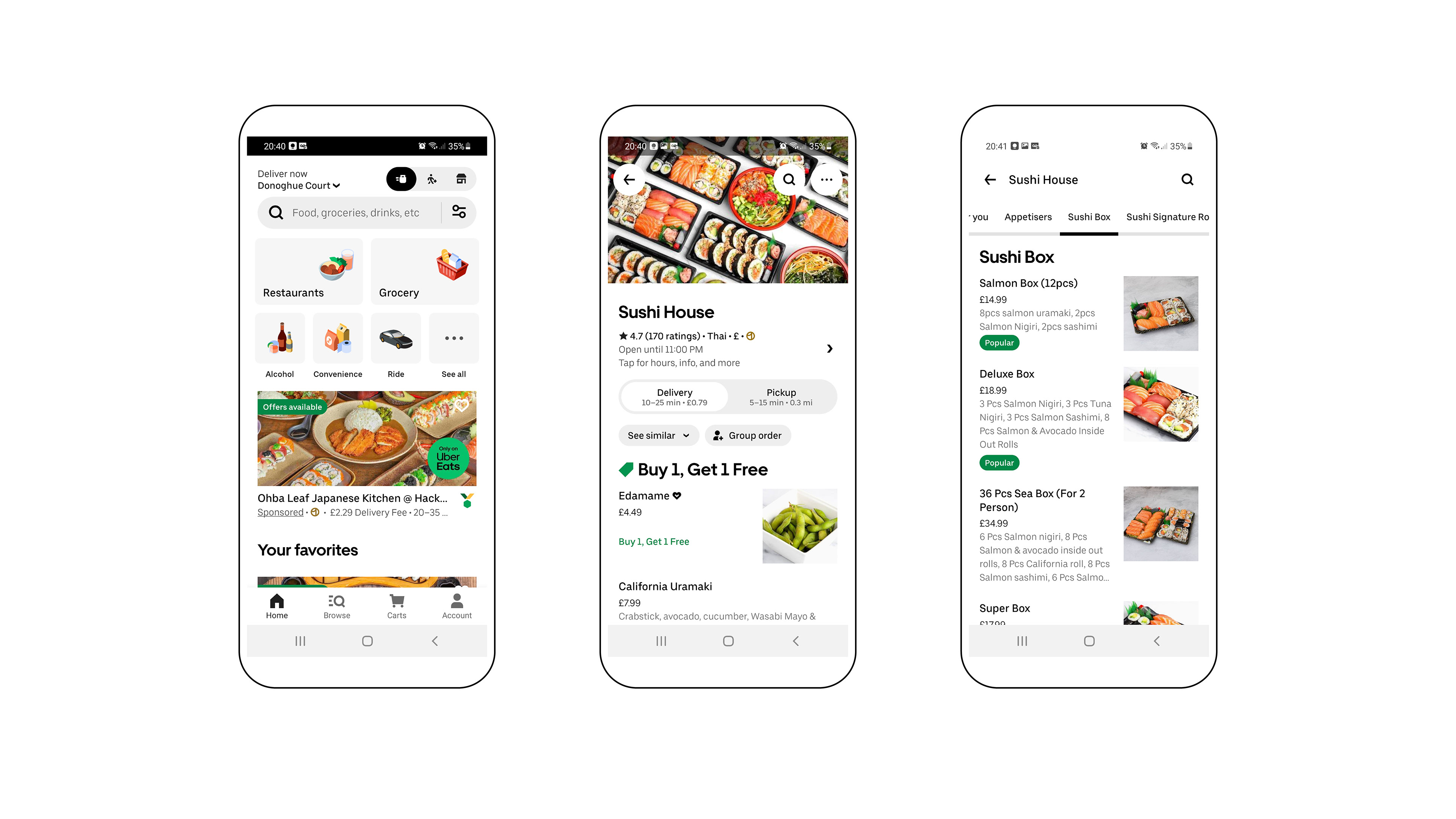
Uber Eats
Another food delivery app similar to Deliveroo. Uber Eats has a cleaner layout and more appealing visuals. Navigation is about the same as on Deliveroo. Most menus have decent photos illutrating the dishes and items and enough information about ingredients and allergens. Categories are also well defined and horizontal scrolling menu is helpful. User flow is also very similar to Deliveroo although number of clicks can also be a bit high.
Understanding the User.
What would be potential user's pain points and needs? For this project, we were asked to imagine what those could be.
I based my understanding of the Japan House app user on the interviews and conversations I had with friends and family as well as my own personal experience using other food delivery apps.
This led me to define a specific scenario: working adults who order sushi often but are frustrated with a poorly designed, glitchy and visually cluttered delivery app from their favorite sushi restaurant.
This group would validate a few initial assumptions about poor results from Japan House's current app.
Other possible problems included lack of information about ingredients, no loyalty programs for recurring customers, few options to customize sushi sets and lack of photos of dishes in the menu, to name a few.
Personas & Storyboarding.
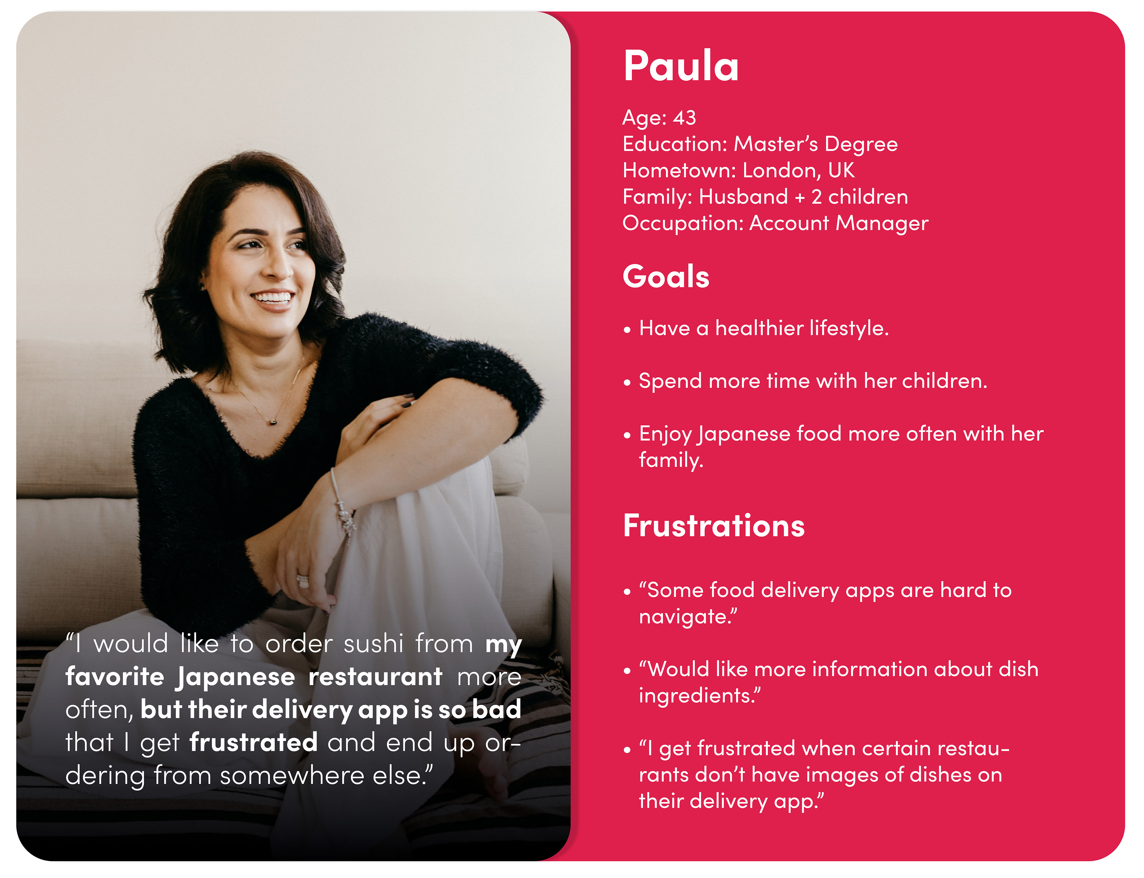
We were tasked to create some personas for this study based on a few examples provided by Google.
This was a bit of a challenge as I felt that I was creating a problem to solve instead of basing it on real data. So for Paula's persona, as I had done when I was imagining who the fictitious Japan House clients could be, I focused on the insights I gathered from my initial talks to friends and family as well as my own experiences using poorly designed apps.
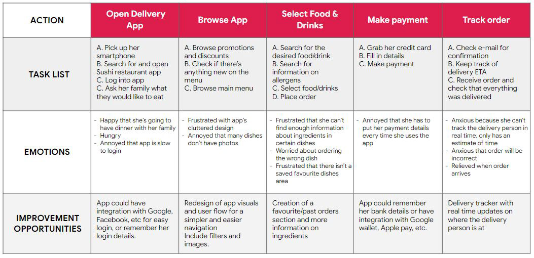
When researching and developing a Persona, I also did some storyboarding to empathize with the user and try to understand possible user flows in the app.
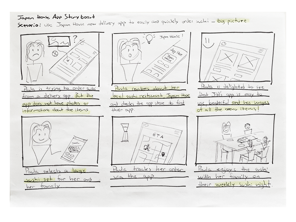

The first storyboard I used to understand what the big picture would be when Paula was ordering for her family and herself.
For the second storyboard (right), I focused on the close-up details of the ordering process; what would be the actual step by step in the app, what features it could have, how the flow could work, etc.
These 2 storyboards, albeit very basic, helped ground the creation of the initial wireframes and lo-fi prototypes.
Problem Statement & Hypothesis.
Paula is a busy account manager and mother of two. She would like a better designed app that makes the ordering process quick and easy, with clear information about menu items and ingredients so that she can enjoy a meal from her favorite Japanese restaurant with her family .
She usually orders for her entire family so she would like a quicker and simpler ordering process.
My hypothesis was that users were frustrated with Japan House's old app because of 3 main issues:
1 - App often crashes and is inconsistent.
2 - Lack of sufficient information about dishes, ingredients and allergens.
3 - Visually cluttered with confusing IA.
Goal Statement.
The goal for the development of this app was defined as:
Japan House app will let users order food and drinks which will affect clients who want to order food on the current app but avoid to do so because it's confusing by giving them a well designed, intuitive and reliable app for home delivery to improve their ordering experience.
Japan House app will let users order food and drinks which will affect clients who want to order food on the current app but avoid to do so because it's confusing by giving them a well designed, intuitive and reliable app for home delivery to improve their ordering experience.
Effectiveness will be measured by analysing number of weekly in-app purchases at different Japan House locations.
User Journey.
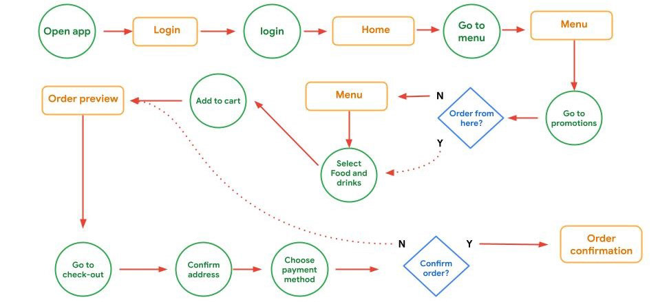
I started out by mapping out a fictitious user flow with the current app to better understand where the pain points appeared and how the app behaved during a regular order placement. As stated before, this user flow was based on examples provided by Google as well as my own research and experiences with other apps.
This user flow would validate some of the points I had raised in my hypothesis and would bring some new insights about the use of the app I was tasked to redesign and why it could be causing a negative experience for its users such as Paula.
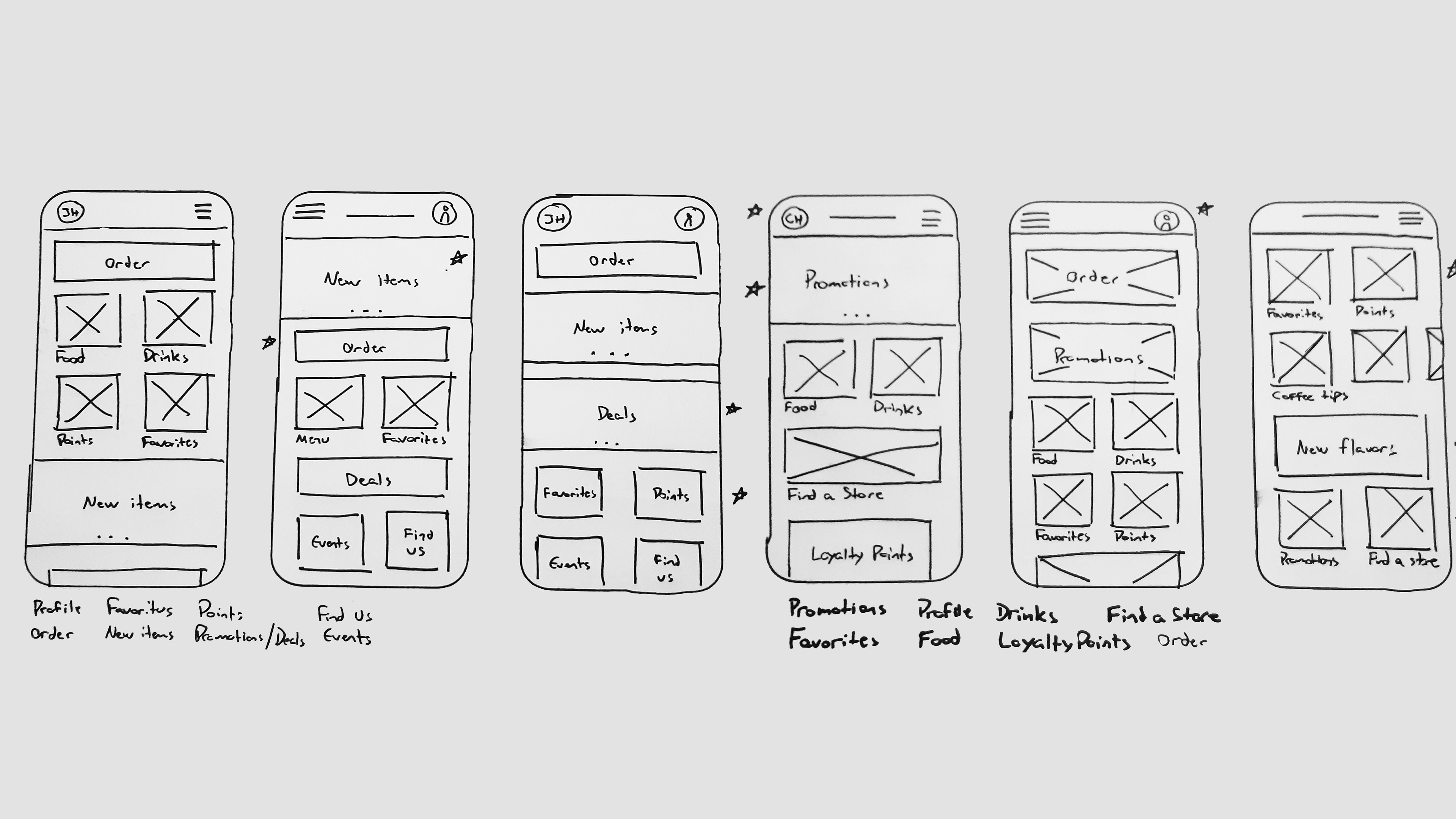
Wireframes & Lo-Fi.
I spent a good time sketching out wireframes at the initial stage of this app’s development to make sure I had explored a good range of alternatives. The goal here was to achieve a layout and flow that was simple, intuitive and visually interesting to make the ordering process quick and easy.
I also created a basic user flow for a simple ordering process on the app. This served as a starting point when moving from paper wireframes to digital lo-fi screens.
When moving to digital lo-fi wireframes in Figma I made sure to base my designs on the insights I gathered from the user research conducted earlier.
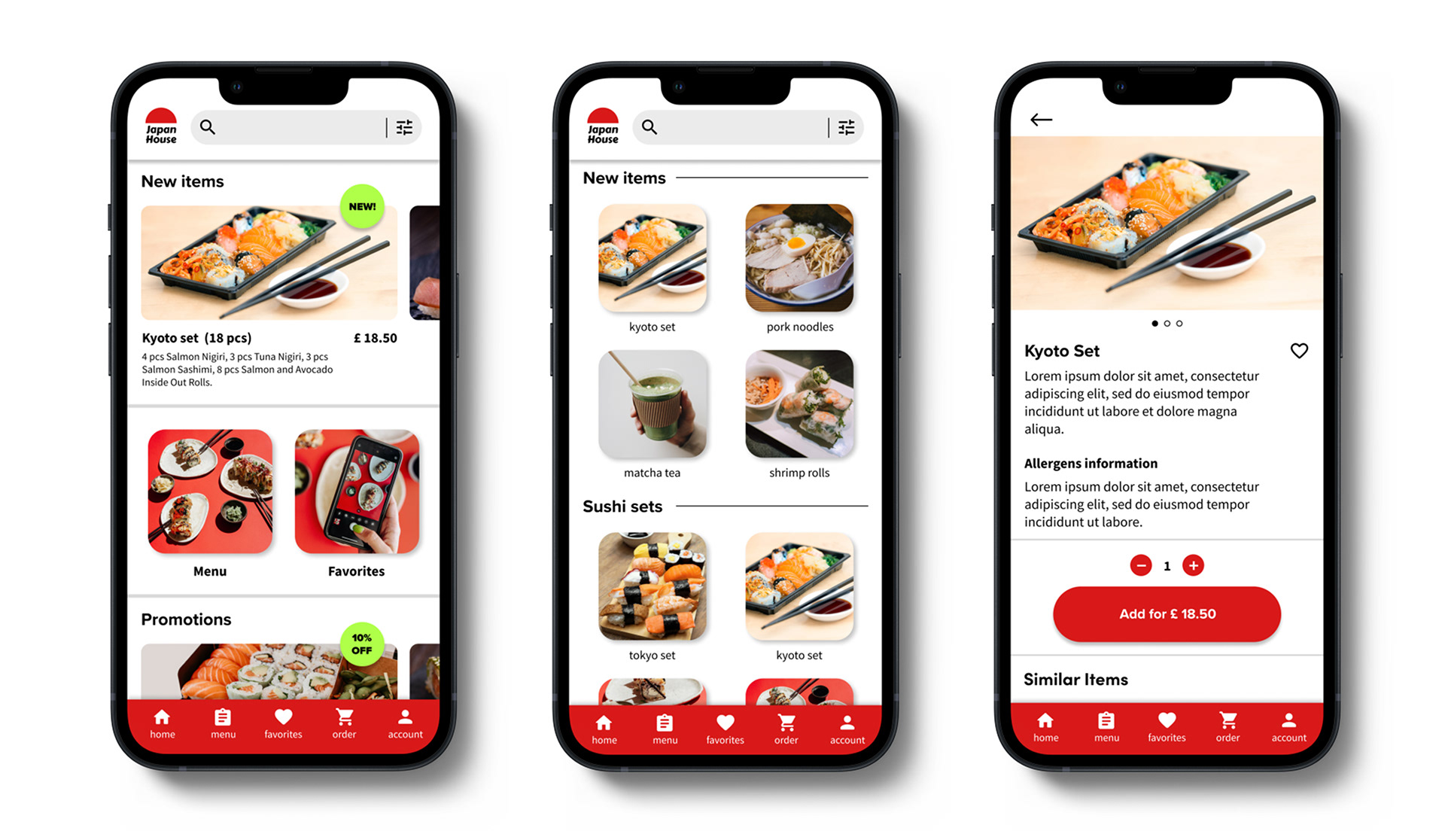
Following what I had sketched out in the paper wireframes, I started by exploring a few different layouts for the main categories such as Menu, Favorites, Meal Deals, New Items and a few others. The goal here was to explore ways of creating an interesting layout that was also simple, consistent and easy to understand.
The circular theme for the images was inspired by the shape of sushi rolls. This was later dropped in favor of a more traditional square shape for more efficient use of space for photos, consistency and text layout.
First Usability Study (lo-fi).
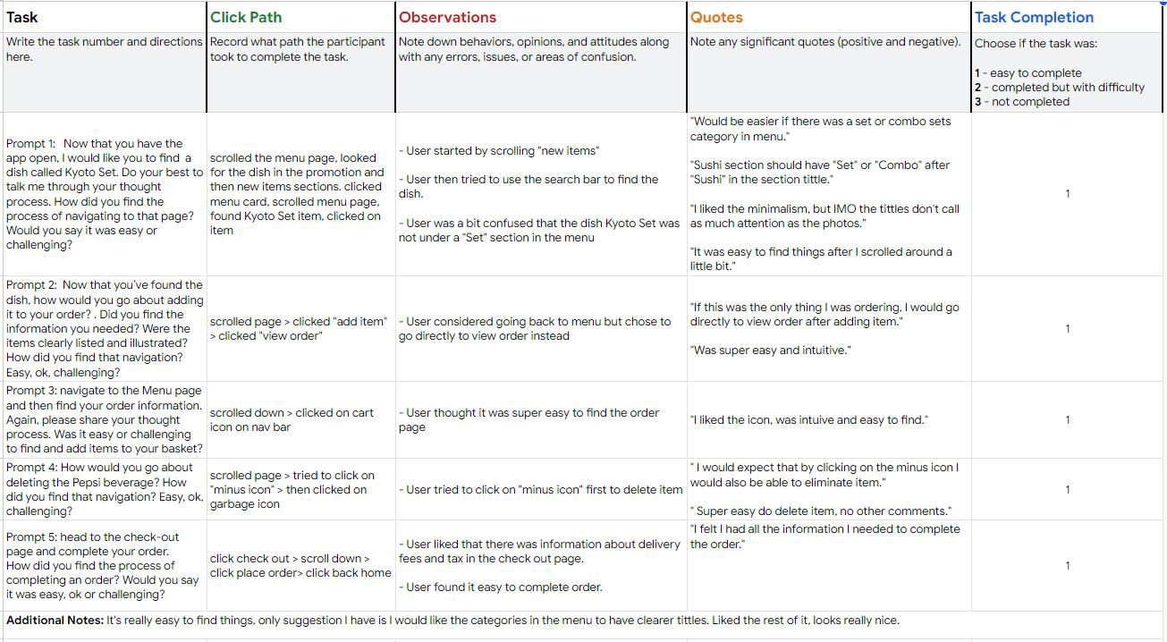
For the first usability study I interviewed 6 people ranging from ages 26 to 40, split between 4 women and 2 men.
This session was unmoderated and done over Google Teams. Participants were asked to complete a few tasks on a lo-fi prototype built in Figma.
Research goals:
Understand how users navigate the lo-fi prototype to complete an order. What are their pain points and needs? What are their challenges and what do they find easy to achieve with the app?
Research questions:
Some of the research questions included "how many times a week do customers order sushi?" , "how easy or challenging is it to complete an order?", "how long does it take for them to place an order?" and a few others. These questions helped me understand how users interact with the lo-fi prototype, what they expected as well as what they enjoyed and what they disliked.
KPIs:
I used a few basic KPIs to help establish the goals of this usability study and guide future improvements. The three main ones I used were:
- Time on Task
- User error rates
- Conversion rates
Insights & Affinity Diagram.
From the first usability test I was able to observe users navigating the prototype and gather some insights regarding the layout of the app, its information architecture as well as better understand what users were expecting during the tasks I asked them to complete.
I was then able to cluster similar insights that stood out more than others. These would guide the next steps to improve the navigability and use of the app.
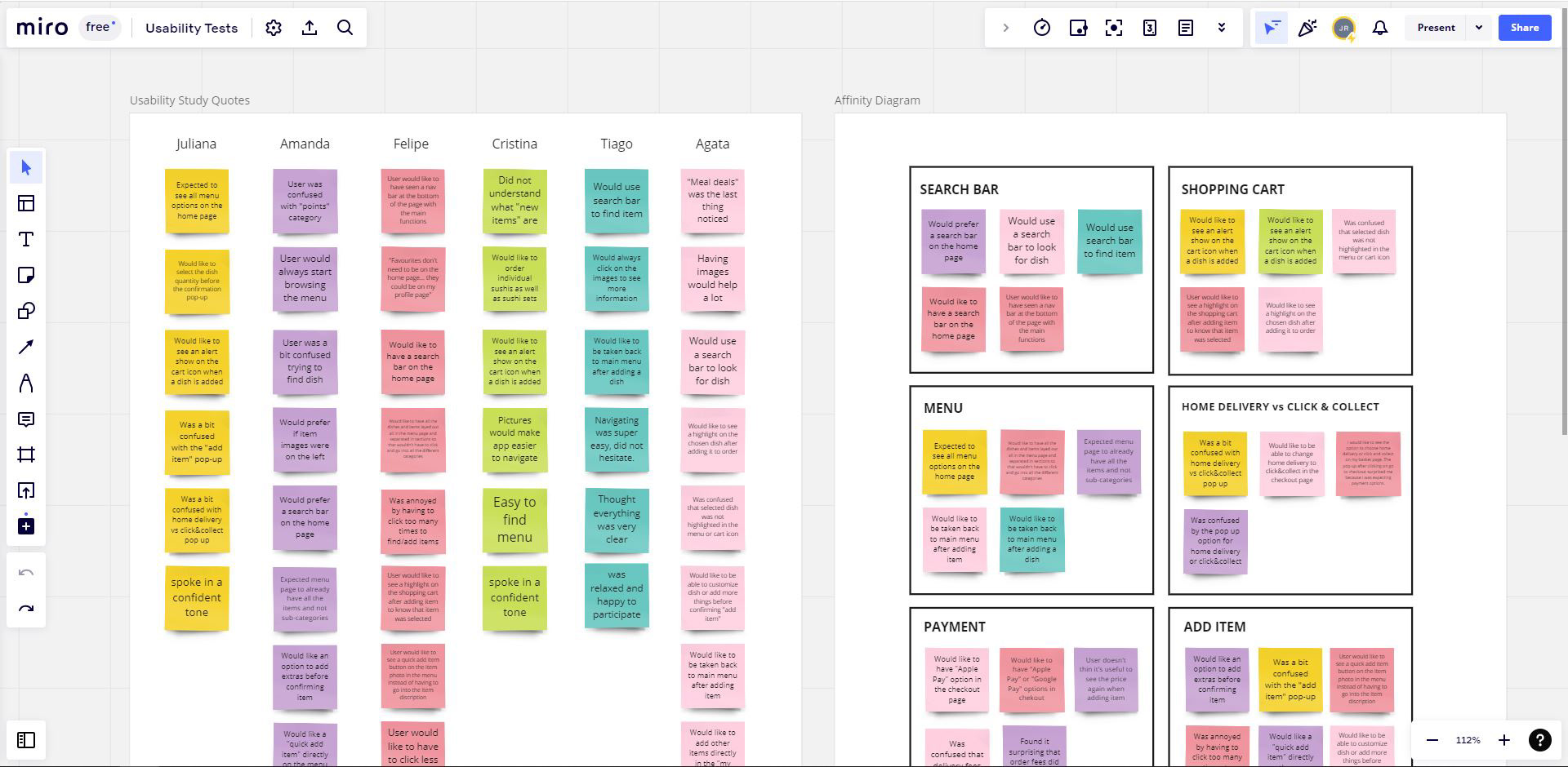
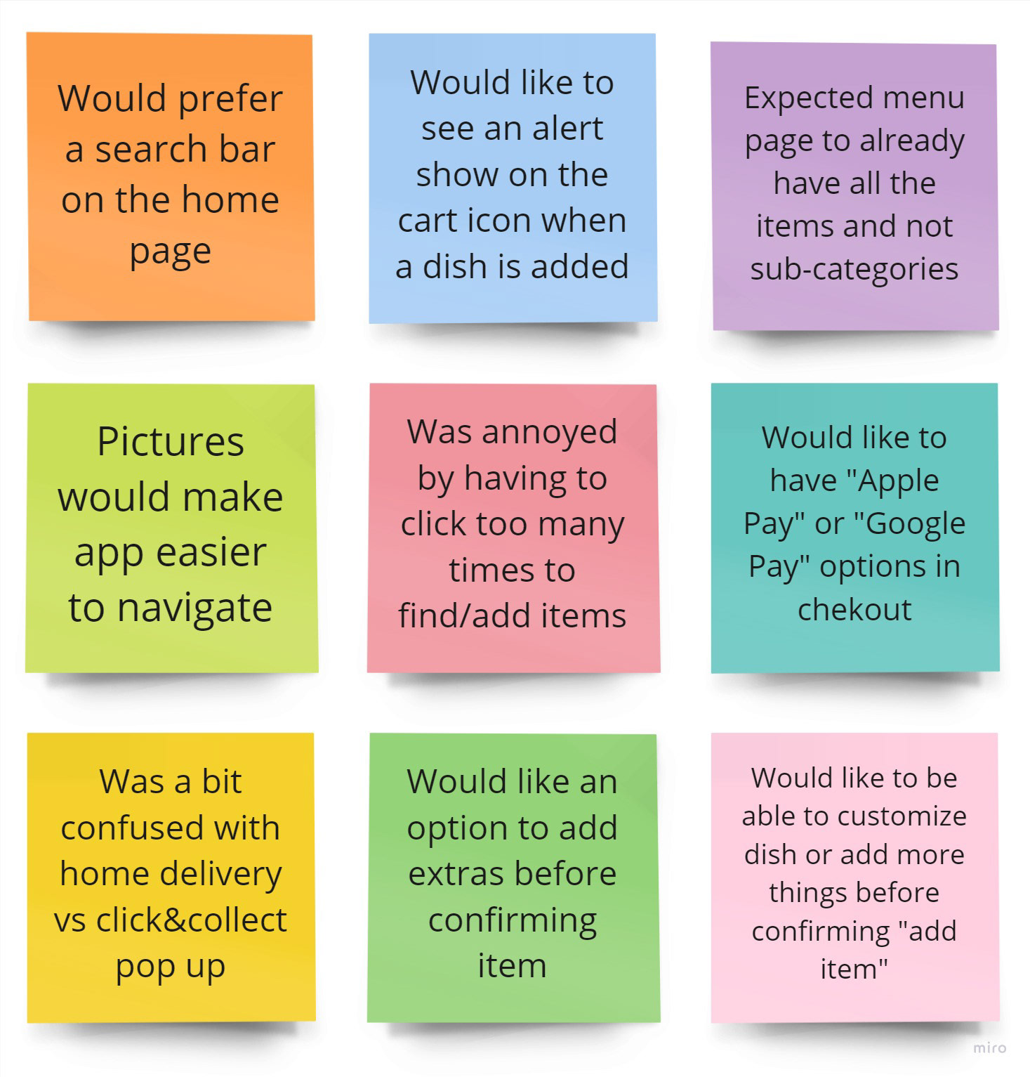
From observing the users and having gathered their comments, I selected a few that either stood out more or that I thought were the most important to tackle first.
These included comments about search bars and quickly finding menu items, navigating the menu, photos and information about dishes, amount of clicks needed to navigate the app, among a couple of other relevant comments.
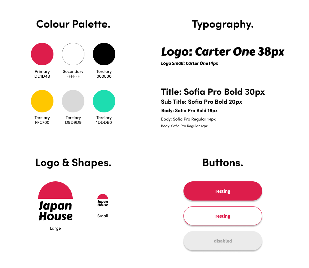
Brand Visual Exploration.
When moving into the mid-fi prototype I also started to look at the aesthetics of the app. I wanted something clean and simple with few colors since the photos of Japanese dishes would be colorful enough.
If this was based on a real brand and a complete rebranding wasn't on the brief, then the current brand language would dictate the rules for colors, fonts, shapes etc. But as this was an app for a fictious business, I had the liberty to create a visual brand language for Japan House.
First idea that came to mind was using the primary colors of the Japanese flag: red and white. I used these colors throughout the mid-fi screens on the logo, buttons and other details. However, as the project evolved, I found that the shade of red I was using was lacking something. I explored a few other shades of red and magenta and eventually landed on a shade or red that was inspired by the colour of tuna meat, one of the most prestigious fish in Japanese cuisine.

I also explored some initial ideas for the logo again based on the Japanese flag and also on Mount Fuji, but quickly landed on a simple shape inspired by the phrase "the land of the rising sun". I did not have much time to spend on the development of Japan House's brand identity, so I focused on keeping it simple.
While exploring logos and general brand identity, I also tested different fonts, colors and shapes to start building an identity for the app. This led to the Style Tile below, which represents a very small sample of what would eventually become the brand identity for Japan House.
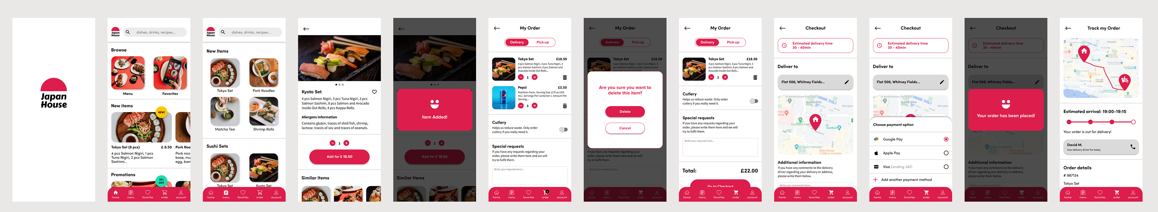
From Lo-Fi to Mid-Fi.
The menu section was one area where I focused a lot of attention to make sure it was easy and clear to navigate for regular users and especially for first time users of the app.
Another important issue I tackled was reducing the amount of clicks needed to navigate the app, especially when browsing the menu and choosing items.
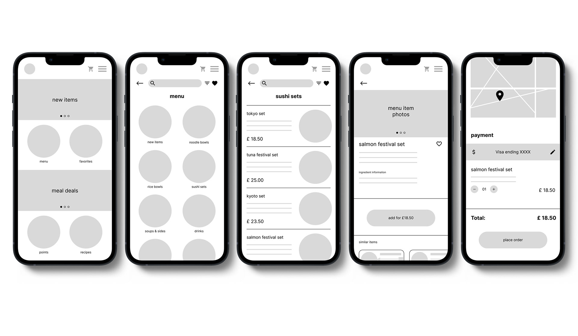
Initially I designed a menu page with categories but after the first usability study it was clear that most users wanted all the available food and drink items displayed on one single page so they could scroll and avoid having to navigate back and forth between different categories.
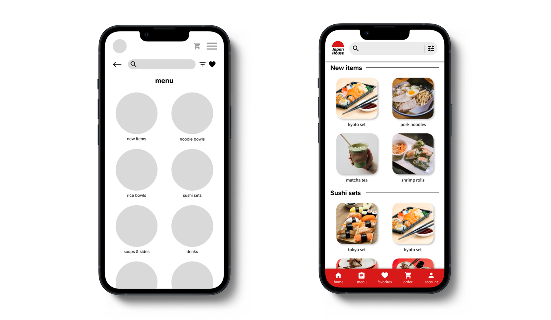
On the left, initial lo-fi prototype with menu laid out with cards to access sub-categories. On the right, mid-fi prototype with improved menu page design with all categories in one page and incorporating photos and navigation bar on the bottom.
A menu item page with clear, high quality photos of the selected item as well as detailed information about contents and ingredients was also key to improve user understanding and facilitate item selection.
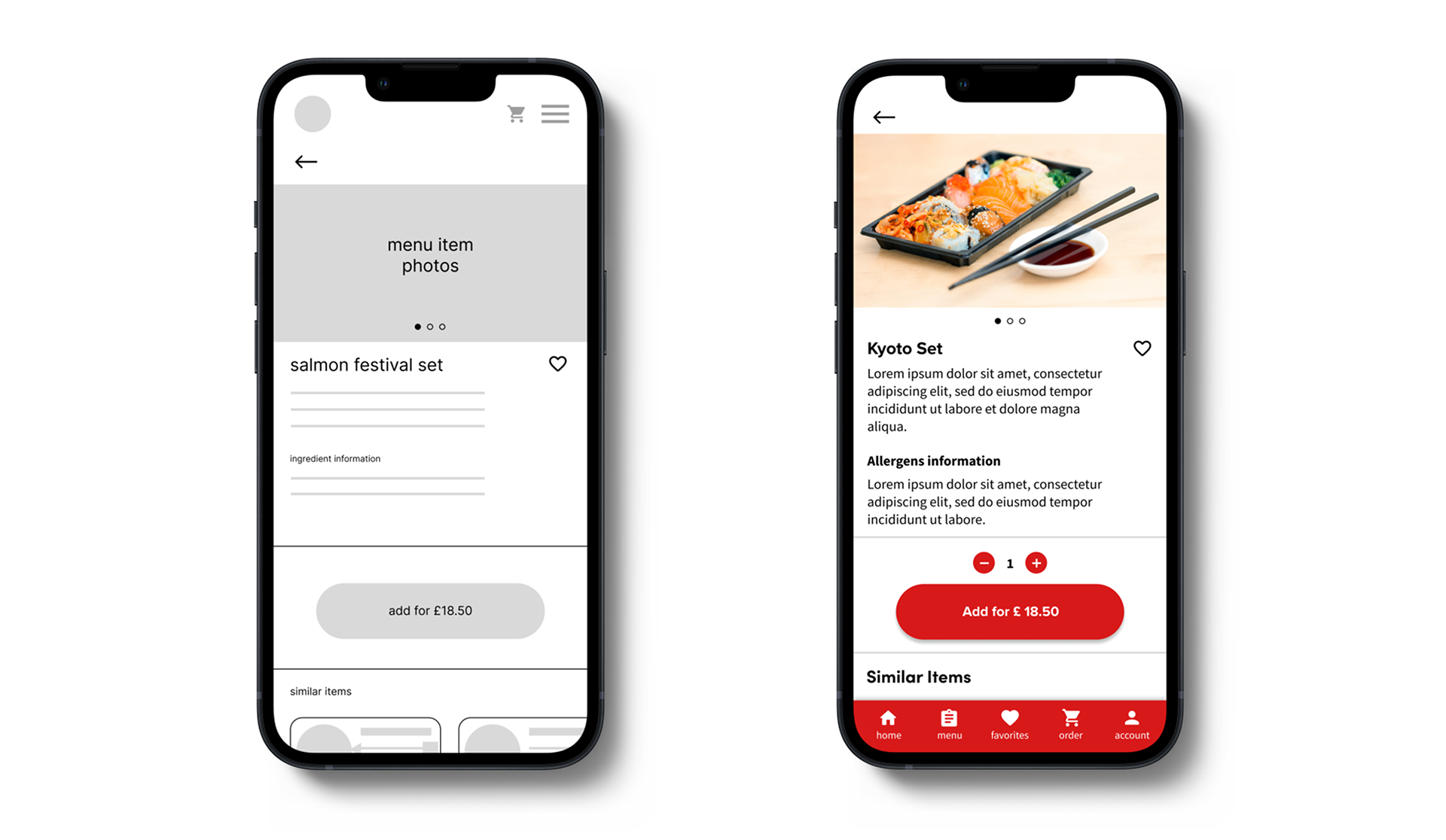
Having photos of the items helps users quickly understand what they are ordering as well as those who might still be learning English, given the fact that London is a very cosmopolitan city with people from many different backgrounds.
Second Usability Test (mid-fi).
Having understood a few of the pain points and gathered insights from the first usability study, I further developed the app to address those and followed up with a second usability study. I interviewed 5 people also ranging from ages 26 to 40, split between 3 women and 2 men.
This session was also unmoderated and done over Google Teams. Participants were asked to complete a few tasks on a mid-fi prototype built in Figma.
Research goals:
I wanted to validate some of the changes I had done based on the first usability study. Some of these included the addition of a search bar in the home page, an improved menu page without sub-categories to improve navegability and reduce number of clicks, improved design with photos and detailed information about menu items and a couple of other details.
Research questions:
Research questions revolved around ease of navigation of the menu page, what the user thought about the ordering process, deleting items from their order list, payment process, overall layout and design as well as a few others.
KPIs:
As before, I used a few basic KPIs to help establish the goals of this usability study and guide future improvements. The three main ones I used were:
- Time on task
- User error rates
- Conversion rates
Hi-Fi Prototype.
Following both usability tests I conducted, I refined the design based on the insights and feedback I gathered.
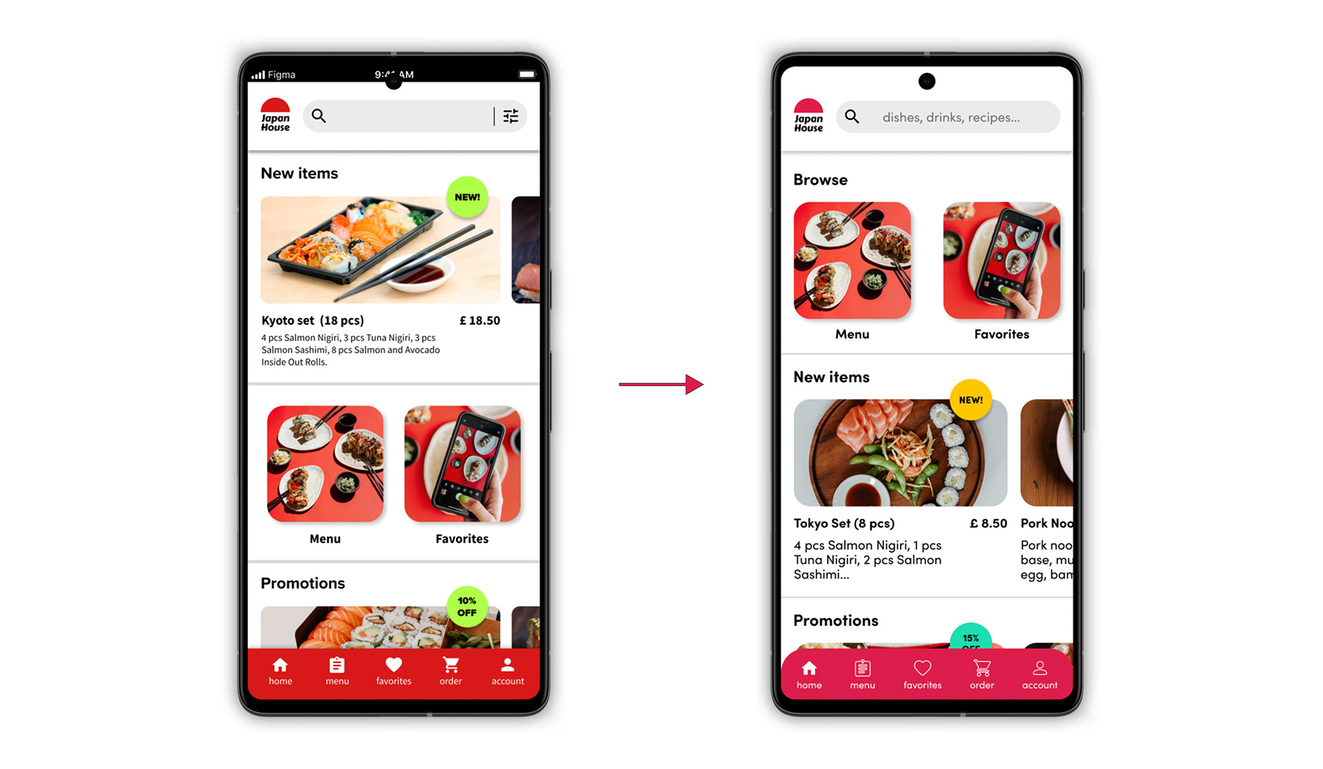
Initial designs had “New items” highlighted at the top. But after the 2nd usability test, it was clear that the “Menu” and “Favorites” cards should be prioritized at the top as that is what users looked for first when opening the app. Quick and obvious navigation to the menu page was key. Search bar was also simplified.
For the final hifi prototype, a few items were improved to reduce numbers of clicks, make the visuals clearer and simpler and some pages were removed to streamline the user flow. Warning pop up when deleting items was added, checkout page was simplified and a “track order” page was also added.

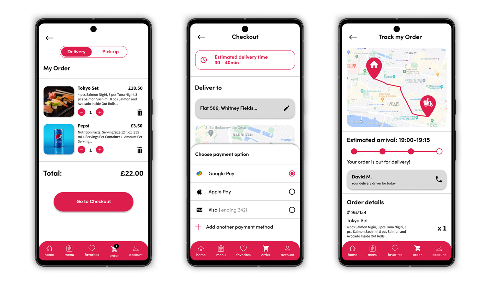
You can try out the hi-fi prototype by clicking on the image below. This will take you to a Figma prototype. It covers a simple user flow from the splash screen all the way to Track My Order page.
Next Steps.
This is where this project ended! However, there are still quite a lot of areas of the app that need to be built such as the Points, Recipes and Favorites sections. Some bits of the user flow can also still be improved. It's an iterative process. Some of the main points to look at moving forward are:

Thank You!